INTERVIEW NO. 26
Fagerström
Spain

Introduction
fagerström® is a design studio, based in Madrid, with focus on visual identity, branding & packaging, that works for clients in North America, Europe and the Middle East.
We seek to develop projects that combine a meticulous work with a strong creative concept. Our goal is to provide each brand, company or project with a solid, recognizable and unique identity.


How do you describe your work?
In our work we always try to design from a concept, and not from aesthetics or form. That is why we give great importance to the conceptual phase and to the development of a strategic proposal for each project.
From there, we seek to develop simple graphic solutions, with some element that is powerful and that serves to communicate a central idea.
In addition, we try to ensure that each element of visual identity plays a specific role, so for us a project is never just a logo or a packaging, but the entire visual universe that we have to build.
We work for clients from all over the world, regardless its size and approaching each project as if it were our own.


A designer o studio you admire?
It is difficult to choose because we are always exploring and looking for new visual references, so, depending on when we are asked this question, our answer will be different; but here we list a few of them:


Could you tell us about any of your projects?
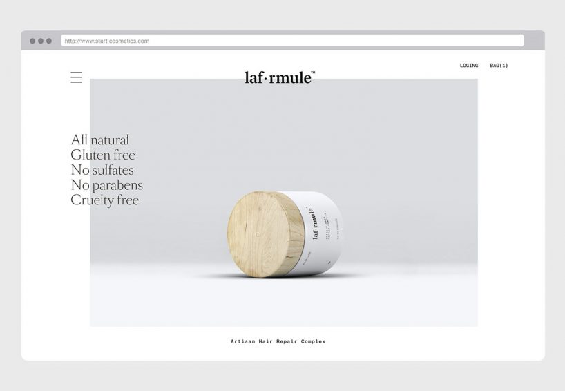
La Formule is a new hair mask, developed by Start Cosmetics, that with just one application achieves an incredible bright, strong and healthy hair, thanks to its unique blend of vitamins, essential oils, amino acids and bio proteins. It is a 100% natural product, very easy to use and that offers amazing results in a very short period of time.
This was an integral project, which consisted in the development of the brand strategy, naming, visual identity and packaging. All the brand identity, from naming to packaging, is designed to highlight the idea of a unique formula of ingredients that deserves to be revealed.
The logo plays with two dots that represent the small particles in the formula, which are integrated into the brand replacing one of its letters and part of another.
For the product container, we suggested a white jar with a wooden lid to reinforce the natural character and the artisan spirit of the product, all this accompanied by an elegant, clean and minimalist design.
For the outer box we used the list of ingredients as the main graphic element, giving great prominence to them to reinforce the idea of a revealed formula.
As a complementary graphic element, we added a stain of the color of the product, to generate a link with it and to create a balance between the clinical look and a handmade product.
For us it was a very successful project because the client allowed us to get involved in the different stages of the process and because it gave great value to our recommendations.
On the other hand, good communication between both parties allowed us to understand their needs well and make improvements to the design thanks to the feedback we received.


