INTERVIEW NO. 2
Emilio Patuzzo
Italy
Introduction
I am Emilio Patuzzo, 26 years old graphic designer based in Milan. I earned a master degree in fall 2016 from Politecnico di Milano, and I am currently working on personal projects and academic publications.
Despite graduating in communication design, as a student I got the opportunity to broaden my studies and to focus on architecture history, photography, interior and product design, data visualisation and semiotic. On my second year of university I got selected to take part to the Master of European Design (MEDes): an exchange programme which involves seven of the best design schools all over Europe, aiming to provide a wider approach to the discipline of design. I therefore spent the third year of the bachelor in Glasgow at the Glasgow School of Art, and the first year of the master degree in Paris at Les Ateliers. The experience was very worthwhile, since it allowed me to approach design from very different perspectives, and to design products and services: something I had never worked on before.
Lastly I returned to Milan and attended data visualisation and semiotic classes with Paolo Ciuccarelli, Salvatore Zingale and the density design LAB. For my master degree thesis I therefore decided to explore the relation between semiotic and design, and more specifically to investigate the relation between semiotic and data visualisation. The work was awarded by the university with top marks and honor.


How do you describe your work?
While designing, what matters most to me is to preserve the accuracy between the graphic signs used (expression) and the message I want to communicate (content). I try and do my best to keep all my projects as simple as possible, aiming to realise strong artefacts by using a very little number of elements carefully structured and balanced. Most of all, every “visual variable” (Jacques Bertin) part of the artefact I am working on has to be consciously designed according to the “visual text” I am aiming to communicate: I personally believe graphic design is just about translating “something” – which might either be a written text, rather than a sound, an idea, etc. etc. – into a visual text – which might be a typographic composition, an illustration, a picture or whatever sign is drawn onto a 2-dimensional surface – (Roman Jakobson – better discussed in my master thesis).
So basically, what makes a design timeless to me, is the precision, the correctness and the effectiveness of a “graphic translation”.


A designer o studio you admire?
Among all professionals I admire and look up as the greatest graphic designers of all times, Giovanni Pintori is one of those I definitely I have to mention. Since the very first time I saw his work I got impressed by how he succeeded in defining such a personal and original graphic language. Pintori became a symbol of the italian graphic design: lead by his talent and personal taste turned out to reinterpret and to emancipate from the more popular “international style”. He was committed to the Olivetti, a factory which reflected the values he was embracing himself. Pintori’s aesthetic became the expression of the design of the 60es and 70es, when Italian design was lead by the intent of spreading knowledge, and to educate people to a new modern visual taste.


Could you tell us about any of your projects?
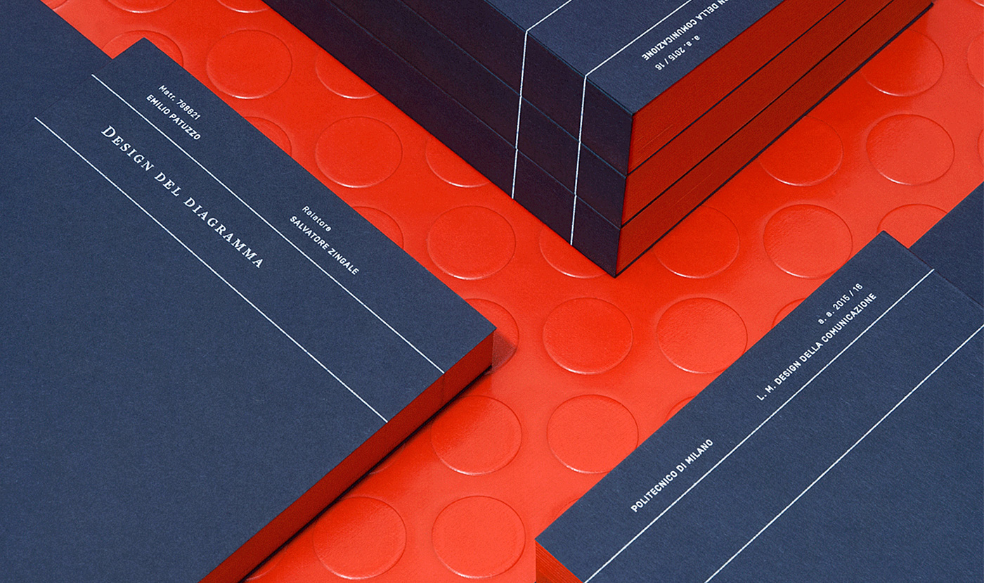
“Designing diagrams, a graphics’ semiotic” is a theoretical essay I wrote for my master degree. For more than two years, I researched on semiotic and linguistic essays, looking for the right means to understand how to improve and evolve the diagrammatic language. While researching I realised how semiotic can actually provide theoretical tools to help defining the design discipline itself; to better exploit the expressive potentiality of the languages (whichever they might be) we make daily use of; to guide the designer through the creative process, so distinctive of our practice. This essay is consequently aiming to provide new ways and methodologies to design graphics and diagrams according to message or content being conveyed, and finally to highlight the importance of involving designers in visualising data.
The book has been kept very simple. The size of the thesis resembles to the one used for the PBE’s books by Einaudi: the book series which my bibliography is mainly composed of. The graphic system is essential, showing all the useful info required to help the reader going through the thesis on every page. “Designing diagrams” has been printed on Fedrigoni’s and G. F. Smith’s paper, crafted and painted manually in order to add value to the object. Red is the color of the thread used for the binding, as well as to paint the fore edge of the book, and to make the shipping package: the only feature so peculiar of the project.


